

浏览器兼容:支持Firefox, Chrome, Safari, Opera, IE10, IE9不支持渐变效果, IE8以下不支持。
HTML结构
整个结构有一个ul无序列表构成,每个li下面都有一个含图片和标题的内容的figure元素,figure下的figcaption用来显示标题的内容。
<figure> 标签规定独立的流内容(图像、图表、照片、代码等等)。
figure 元素的内容应该与主内容相关,但如果被删除,则不应对文档流产生影响。
<figcaption> 标签定义 figure 元素的标题(caption)。
“figcaption” 元素应该被置于 “figure” 元素的第一个或最后一个子元素的位置。
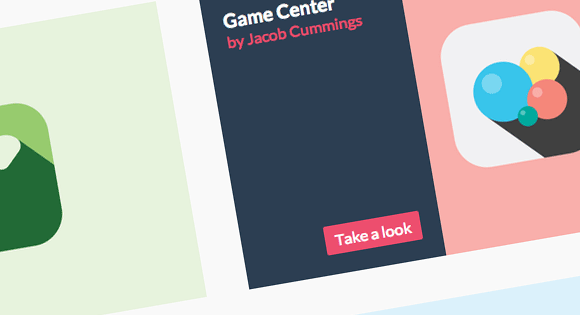
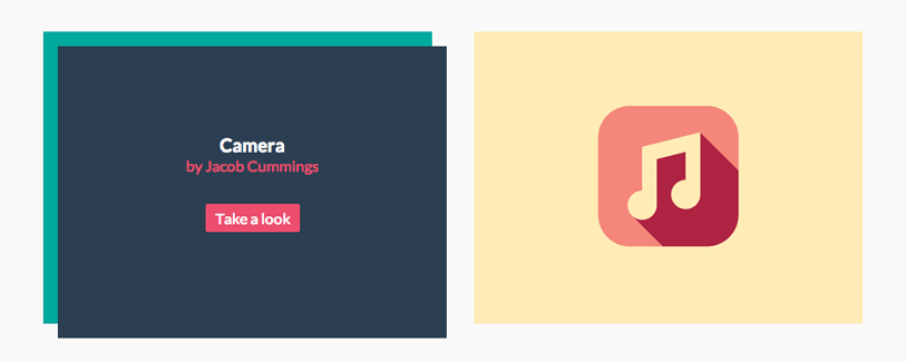
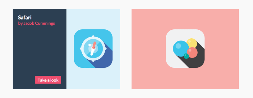
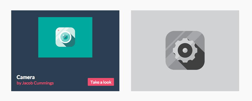
<ul class="grid cs-style-1">
	<li>
		<figure>
			<img src="images/1.png" alt="img01"/>
			<figcaption>
				<h3>Camera</h3>
				<span>Jacob Cummings</span>
				<a href="http://dribbble.com/shots/1115632-Camera">Take a look</a>
			</figcaption>
		</figure>
	</li>
	<li>
		<figure>
			<!-- ... -->
		</figure>
	</li>
	<!-- ... -->
</ul>
上面HTML是不同效果的基础结构。对于效果1,我们命名样式为cs-style-1,效果2将是cs-style-2依次类推,后面将详细介绍每种效果的具体css。
一些公共的CSS
首先我们来定义一些不同效果的基础css,ul和li的样式:
.grid {
	padding: 20px 20px 100px 20px;
	max-width: 1300px;
	margin: 0 auto;
	list-style: none;
	text-align: center;
}

.grid li {
	display: inline-block;
	width: 440px;
	margin: 0;
	padding: 20px;
	text-align: left;
	position: relative;
}
li的display设置成inline-block是为了可以使用text-align属性来相对于它的父元素进行对齐。
重置figure的margin,并且设置它的position属性为relative, 因为我们将要用绝对位置来定位figcaption元素,所以需要显式的声明figure的position为relative。
.grid figure {
	margin: 0;
	position: relative;
}
image的max-width设置成100%,这样当我们使用media query去改变li的大小的时候会max-width会起到很好地效果。
.grid figure img {
	max-width: 100%;
	display: block;
	position: relative;
}
figcaption将使用绝对定位,默认的我们定义它显示在左上角,这里不定义任何宽高信息,我们将在不同的效果中单独定义它们。
.grid figcaption {
	position: absolute;
	top: 0;
	left: 0;
	padding: 20px;
	background: #2c3f52;
	color: #ed4e6e;
}
定义一些基础的文本和超链接样式
.grid figcaption h3 {
	margin: 0;
	padding: 0;
	color: #fff;
}

.grid figcaption span:before {
	content: 'by ';
}

.grid figcaption a {
	text-align: center;
	padding: 5px 10px;
	border-radius: 2px;
	display: inline-block;
	background: #ed4e6e;
	color: #fff;
}
我们将使用伪类:before为包含作者名字的span添加“by”文字,当然你可以直接在html的文本中添加它,这里这么设置只是为了方便更改这个文字,例如:“made by” or “Designer: ”等等。
最后我们添加media query以适应小屏幕的显示
@media screen and (max-width: 31.5em) {
	.grid {
		padding: 10px 10px 100px 10px;
	}
	.grid li {
		width: 100%;
		min-width: 300px;
	}
}
接下来让我们实现一些漂亮的效果吧。
效果一:标题向右下浮出3d效果
我们将要实现的效果是:将鼠标悬停与图片之上时,标题内容显示,同时向右下移动,类似3d突起的效果。
首先定义figcaption的宽高为100%,初始化透明度opacity为0,同时设置backface-visibility: hidden;渐变时背景不可见。
backface-visibility 属性可用于隐藏内容的背面。默认情况下,背面可见,这意味着即使在翻转后,变换的内容仍然可见。但当 backface-visibility 设置为 hidden 时,旋转后内容将隐藏,因为旋转后正面将不再可见。
visible:默认值,旋转的时候背景可见。
hidden:旋转的时候背景不可见。
.cs-style-1 figcaption {
	height: 100%;
	width: 100%;
	opacity: 0;
	text-align: center;
	backface-visibility: hidden;
	transition: transform 0.3s, opacity 0.3s;
}
当鼠标悬停在图片上时,设置opacity为1,并且向左下平移15px,15px,同时定义一些文本的样式。
.no-touch .cs-style-1 figure:hover figcaption,
.cs-style-1 figure.cs-hover figcaption {
	opacity: 1;
	transform: translate(15px, 15px);
}

.cs-style-1 figcaption h3 {
	margin-top: 70px;
}

.cs-style-1 figcaption span {
	display: block;
}

.cs-style-1 figcaption a {
	margin-top: 30px;
}
效果二:图片向上移动在底部显示标题
当鼠标悬停与图片上的时候,需要把把图片向上移动,这里通过transition的transform实现,并设置img的z-index为10保证图片在标题上面。接下来需要显示标题,并为标题figcaption设置宽高信息,因为是绝对定位我们设置bottom为0使其在底部显示。最后定义button的样式。
.cs-style-2 figure img {
	z-index: 10;
	transition: transform 0.4s;
}

.no-touch .cs-style-2 figure:hover img,
.cs-style-2 figure.cs-hover img {
	transform: translateY(-90px);
}

.cs-style-2 figcaption {
	height: 90px;
	width: 100%;
	top: auto;
	bottom: 0;
}

.cs-style-2 figcaption a {
	position: absolute;
	right: 20px;
	top: 30px;
}
效果三:标题将图片向上推起
效果三和效果二基本一样,不同的是图片向上移动的过程中,我们隐藏掉多出边框的图片部分。
首先设置超出figure的部分隐藏掉,然后设置当hover在图片上时,图片向上移动translateY(-50px),因为设置了figure添加overflow:hidden所以超出figure的部分会被隐藏。
.cs-style-3 figure {
	overflow: hidden;
}

.cs-style-3 figure img {
	transition: transform 0.4s;
}

.no-touch .cs-style-3 figure:hover img,
.cs-style-3 figure.cs-hover img {
	transform: translateY(-50px);
}
设置标题内容figcaption初始宽高和opacity,opacity初始为0,并添加过渡效果。此处的过渡效果在hover out图片之后显现,添加0.3s的延时使过渡效果显得更加自然。
.cs-style-3 figcaption {
	height: 100px;
	width: 100%;
	top: auto;
	bottom: 0;
	opacity: 0;
	transform: translateY(100%);
	transition: transform 0.4s, opacity 0.1s 0.3s;
}
接下来我们定义鼠标hover到图像上之后的figcaption样式。hover是需要显示标题内容设置opacity为1,同时为其添加过渡效果。
.no-touch .cs-style-3 figure:hover figcaption,
.cs-style-3 figure.cs-hover figcaption {
	opacity: 1;
	transform: translateY(0px);
	transition: transform 0.4s, opacity 0.1s;
}
最后是button的样式。
.cs-style-3 figcaption a {
	position: absolute;
	bottom: 20px;
	right: 20px;
}
效果四:标题3d折入把图片向右推出
我们将使用li作为前景容器,这样我们才能实现3d效果,同时定义li内部figure的transform-style为preserve-3d。
.cs-style-4 li {
	perspective: 1700px;
	perspective-origin: 0 50%;
}

.cs-style-4 figure {
	transform-style: preserve-3d;
}
为了实现这个效果,需要为img添加一个新的容器div,为什么要做么做呢?因为我们要设置img的父元素为overflow:hidden,当向左移动图片的时候多出figure的图片将被隐藏,你可能会想为什么不直接在figure上添加overflow:hidden,因为这样我们就不能看到漂亮的3d效果了,在上面我们已经为figure加上了transform-style: preserve-3d;属性。
首先hover于图片的时候移动图片:
.cs-style-4 figure > div {
	overflow: hidden;
}

.cs-style-4 figure img {
	transition: transform 0.4s;
}

.no-touch .cs-style-4 figure:hover img,
.cs-style-4 figure.cs-hover img {
	transform: translateX(25%);
}
设置标题内容figcaption初始样式,宽度为50%,透明度为0,以figcaption左边为基准旋转-90°,效果就是图片向屏幕外的方向立起来了,transition在hover out的时候起作用。
.cs-style-4 figcaption {
	height: 100%;
	width: 50%;
	opacity: 0;
	backface-visibility: hidden;
	transform-origin: 0 0;
	transform: rotateY(-90deg);
	transition: transform 0.4s, opacity 0.1s 0.3s;
}
hover时,显示标题内容,同时旋转到0°,想翻书页一样的效果就出现了。
.no-touch .cs-style-4 figure:hover figcaption,
.cs-style-4 figure.cs-hover figcaption {
	opacity: 1;
	transform: rotateY(0deg);
	transition: transform 0.4s, opacity 0.1s;
}
最后是button的样式:
.cs-style-4 figcaption a {
	position: absolute;
	bottom: 20px;
	right: 20px;
}
效果五:标题内容向外放大图片向内缩小

首先定义img的z-index为10保证图片在最上面显示,同时添加hover out的过渡
.cs-style-5 figure img {
	z-index: 10;
	transition: transform 0.4s;
}
hover时图片缩小为40%
.no-touch .cs-style-5 figure:hover img,
.cs-style-5 figure.cs-hover img {
	transform: scale(0.4);
}
接下来是figcaption标题内容,初始缩小为70%,透明度为0,同时定义hover out的过渡效果。
.cs-style-5 figcaption {
	height: 100%;
	width: 100%;
	opacity: 0;
	transform: scale(0.7);
	backface-visibility: hidden;
	transition: transform 0.4s, opacity 0.4s;
}
hover时figcaption标题内容,放大为100%,透明度为1,完全显示。
.no-touch .cs-style-5 figure:hover figcaption,
.cs-style-5 figure.cs-hover figcaption {
	transform: scale(1);
	opacity: 1;
}
最后是button的样式:
.cs-style-5 figure a {
	position: absolute;
	bottom: 20px;
	right: 20px;
}
效果六:图片缩小显示标题内容
这个效果是上面那个效果的一个不同版本,根据这个可以扩展出很多不同的效果,比如图片的位置放到左边,显示更多的文字。
首先同样是事情,只是这一次我们稍微向上移动一下图片:
.cs-style-6 figure img {
	z-index: 10;
	transition: transform 0.4s;
}

.no-touch .cs-style-6 figure:hover img,
.cs-style-6 figure.cs-hover img {
	transform: translateY(-50px) scale(0.5);
}
这次figcaption没有任何的动画效果,只需定义宽高:
.cs-style-6 figcaption {
	height: 100%;
	width: 100%;
}
最后依然是text和button的样式:
.cs-style-6 figcaption h3 {
	margin-top: 60%;
}

.cs-style-6 figcaption a {
	position: absolute;
	bottom: 20px;
	right: 20px;
}
效果七:标题内容围绕图片

为了确保每个边框都在其他图片上面,所以我们需要顶一下每个li的z-index属性值(倒序,最后一个z-index最低):
.cs-style-7 li:first-child { z-index: 6; }
.cs-style-7 li:nth-child(2) { z-index: 5; }
.cs-style-7 li:nth-child(3) { z-index: 4; }
.cs-style-7 li:nth-child(4) { z-index: 3; }
.cs-style-7 li:nth-child(5) { z-index: 2; }
.cs-style-7 li:nth-child(6) { z-index: 1; }
和其他例子一样,需要img显示在上面:
.cs-style-7 figure img {
	z-index: 10;
}
初始的figcaption标题内容宽高和figure一样大。并且使用box-shadow属性添加边框效果。
.cs-style-7 figcaption {
	height: 100%;
	width: 100%;
	opacity: 0;
	backface-visibility: hidden;
	box-shadow: 0 0 0 0px #2c3f52;
	transition: opacity 0.3s, height 0.3s, box-shadow 0.3s;
}
hover时设置透明度为1,并且增加figcaption高度到120%,同时设置box-shadow发散到10px
.no-touch .cs-style-7 figure:hover figcaption,
.cs-style-7 figure.cs-hover figcaption {
	opacity: 1;
	height: 130%;
	box-shadow: 0 0 0 10px #2c3f52;
}
最后定义文本和button的样式,我们想要文字随着整个标题内容二渐渐出现,但是当hover out的时候需要文字立即消失,所以添加了transition: opacity 0s;类实现这个效果。
.cs-style-7 figcaption h3 {
	margin-top: 86%;
}

.cs-style-7 figcaption h3,
.cs-style-7 figcaption span,
.cs-style-7 figcaption a {
	opacity: 0;
	transition: opacity 0s;
}

.cs-style-7 figcaption a {
	position: absolute;
	bottom: 20px;
	right: 20px;
}
当hover的时候,所有元素都渐渐的显示出来:
.no-touch .cs-style-7 figure:hover figcaption h3,
.no-touch .cs-style-7 figure:hover figcaption span,
.no-touch .cs-style-7 figure:hover figcaption a,
.cs-style-7 figure.cs-hover figcaption h3,
.cs-style-7 figure.cs-hover figcaption span,
.cs-style-7 figure.cs-hover figcaption a {
	transition: opacity 0.3s 0.2s;
	opacity: 1;
}
That’s all, Enjoy It!
英文原文链接:http://tympanus.net/codrops/2013/06/18/caption-hover-effects/
回复试试
看看了
问一下你的灯箱效果用的是插件吗。
能直接放wordpress里面实现效果 测试一下吗? 你这里似乎看不到效果了 。 我的是chrome
可以放到wordpress, 你点击演示看不到效果,我这里看是很好的, chrome
代码直接可以用做插件放wordpress里面?
这个不是wordpress插件, 可以自己修改主题的代码,把这个效果功能加上去。
最大的问题是我不知道怎么加。。。。。加在css样式页面里面?那和html加在哪?
又来求教了 怎么放呢?
我没办法在这里给你解释,这一句两句说不明白,你可以自己去查一查教程。
好吧 我用审查元素 自己搞一搞
这个很需要收藏,做效果很好