
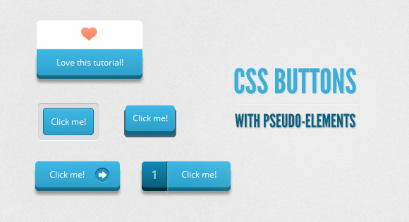
今天我们来使用伪元素来创建不同风格CSS3 button,我们只用一个超链接标签来作为按钮的HTML结构,然后通过强大的CSS来实现Button的样式,当然本篇文章主要是通过使用伪元素。
一些说明:
文章中的css代码将不加入开发商前缀,否则css代码是在是太长了,但是你可以在下载的源码中找到他们。同时我将不使用CSS transitions,因为目前为止只有Firefox支持在伪元素上使用他们,但是我相信即使不适用它,一样可以做出漂亮的Button.
HTML标签:
非常简单的一个超链接标签结构。


- <a href="#" class="a_demo_one">
- Click me!
- </a>
样式一:透明边框风格
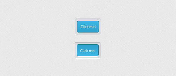
首先我们定义Button的基础样式,还有激活时的样式。
- .a_demo_one {
- background-color:#ba2323;
- padding:10px;
- position:relative;
- font-family: 'Open Sans', sans-serif;
- font-size:12px;
- text-decoration:none;
- color:#fff;
- border: solid 1px #831212;
- background-image: linear-gradient(bottom, rgb(171,27,27) 0%, rgb(212,51,51) 100%);
- border-radius: 5px;
- }
- .a_demo_one:active {
- padding-bottom:9px;
- padding-left:10px;
- padding-right:10px;
- padding-top:11px;
- top:1px;
- background-image: linear-gradient(bottom, rgb(171,27,27) 100%, rgb(212,51,51) 0%);
- }
接下来我们使用::before伪元素来为Button创建一个边框容器,这里使用绝对定位。
- .a_demo_one::before {
- background-color:#ccd0d5;
- content:"";
- display:block;
- position:absolute;
- width:100%;
- height:100%;
- padding:8px;
- left:-8px;
- top:-8px;
- z-index:-1;
- border-radius: 5px;
- box-shadow: inset 0px 1px 1px #909193, 0px 1px 0px #fff;
- }
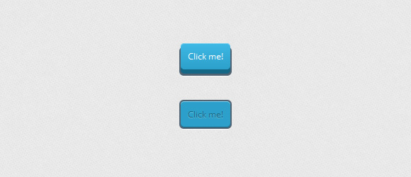
样式二:3D风格1
css:
- .a_demo_two {
- background-color:#6fba26;
- padding:10px;
- position:relative;
- font-family: 'Open Sans', sans-serif;
- font-size:12px;
- text-decoration:none;
- color:#fff;
- background-image: linear-gradient(bottom, rgb(100,170,30) 0%, rgb(129,212,51) 100%);
- box-shadow: inset 0px 1px 0px #b2f17f, 0px 6px 0px #3d6f0d;
- border-radius: 5px;
- }
- .a_demo_two:active {
- top:7px;
- background-image: linear-gradient(bottom, rgb(100,170,30) 100%, rgb(129,212,51) 0%);
- box-shadow: inset 0px 1px 0px #b2f17f, inset 0px -1px 0px #3d6f0d;
- color: #156785;
- text-shadow: 0px 1px 1px rgba(255,255,255,0.3);
- background: rgb(44,160,202);
- }
伪元素样式:因为伪元素的位置是绝对定位,所以位置依赖它的父元素。所以一旦父元素向下移动几个像素,伪元素就需要向上移动相同的像素。
- .a_demo_two::before {
- background-color:#072239;
- content:"";
- display:block;
- position:absolute;
- width:100%;
- height:100%;
- padding-left:2px;
- padding-right:2px;
- padding-bottom:4px;
- left:-2px;
- top:5px;
- z-index:-1;
- border-radius: 6px;
- box-shadow: 0px 1px 0px #fff;
- }
- .a_demo_two:active::before {
- top:-2px;
- }
样式三:3D风格2
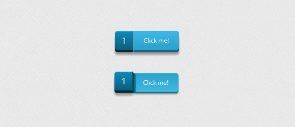
这里注意一下margin-left是为了填补伪元素的位置。
- .a_demo_three {
- background-color:#3bb3e0;
- font-family: 'Open Sans', sans-serif;
- font-size:12px;
- text-decoration:none;
- color:#fff;
- position:relative;
- padding:10px 20px;
- border-left:solid 1px #2ab7ec;
- margin-left:35px;
- background-image: linear-gradient(bottom, rgb(44,160,202) 0%, rgb(62,184,229) 100%);
- border-top-right-radius: 5px;
- border-bottom-right-radius: 5px;
- box-shadow: inset 0px 1px 0px #2ab7ec, 0px 5px 0px 0px #156785, 0px 10px 5px #999;
- }
- .a_demo_three:active {
- top:3px;
- background-image: linear-gradient(bottom, rgb(62,184,229) 0%, rgb(44,160,202) 100%);
- box-shadow: inset 0px 1px 0px #2ab7ec, 0px 2px 0px 0px #156785, 0px 5px 3px #999;
- }
伪元素CSS:
- .a_demo_three::before {
- content:"·";
- width:35px;
- max-height:29px;
- height:100%;
- position:absolute;
- display:block;
- padding-top:8px;
- top:0px;
- left:-36px;
- font-size:16px;
- font-weight:bold;
- color:#8fd1ea;
- text-shadow:1px 1px 0px #07526e;
- border-right:solid 1px #07526e;
- background-image: linear-gradient(bottom, rgb(10,94,125) 0%, rgb(14,139,184) 100%);
- border-top-left-radius: 5px;
- border-bottom-left-radius: 5px;
- box-shadow:inset 0px 1px 0px #2ab7ec, 0px 5px 0px 0px #032b3a, 0px 10px 5px #999 ;
- }
- .a_demo_three:active::before {
- top:-3px;
- box-shadow:inset 0px 1px 0px #2ab7ec, 0px 5px 0px 0px #032b3a, 1px 1px 0px 0px #044a64, 2px 2px 0px 0px #044a64, 2px 5px 0px 0px #044a64, 6px 4px 2px #0b698b, 0px 10px 5px #999 ;
- }
样式四:3D风格3
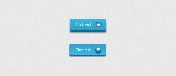
我们使用一个箭头图标作为背景,当然你也可以替换成任何你喜欢的图标。
- .a_demo_four {
- background-color:#4b3f39;
- font-family: 'Open Sans', sans-serif;
- font-size:12px;
- text-decoration:none;
- color:#fff;
- position:relative;
- padding:10px 20px;
- padding-right:50px;
- background-image: linear-gradient(bottom, rgb(62,51,46) 0%, rgb(101,86,78) 100%);
- border-radius: 5px;
- box-shadow: inset 0px 1px 0px #9e8d84, 0px 5px 0px 0px #322620, 0px 10px 5px #999;
- }
- .a_demo_four:active {
- top:3px;
- background-image: linear-gradient(bottom, rgb(62,51,46) 100%, rgb(101,86,78) 0%);
- box-shadow: inset 0px 1px 0px #9e8d84, 0px 2px 0px 0px #322620, 0px 5px 3px #999;
- }
- .a_demo_four::before {
- background-color:#322620;
- background-image:url(../images/right_arrow.png);
- background-repeat:no-repeat;
- background-position:center center;
- content:"";
- width:20px;
- height:20px;
- position:absolute;
- right:15px;
- top:50%;
- margin-top:-9px;
- border-radius: 50%;
- box-shadow: inset 0px 1px 0px #19120f, 0px 1px 0px #827066;
- }
- .a_demo_four:active::before {
- top:50%;
- margin-top:-12px;
- box-shadow: inset 0px 1px 0px #827066, 0px 3px 0px #19120f, 0px 6px 3px #382e29;
- }
样式五:3D风格4
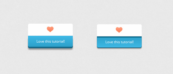
CSS:
- .a_demo_five {
- background-color:#9827d3;
- width:150px;
- display:inline-block;
- font-family: 'Open Sans', sans-serif;
- font-size:12px;
- text-decoration:none;
- color:#fff;
- position:relative;
- margin-top:40px;
- padding-bottom:10px;
- padding-top:10px;
- background-image: linear-gradient(bottom, rgb(168,48,232) 100%, rgb(141,32,196) 0%);
- border-bottom-right-radius: 5px;
- border-bottom-left-radius: 5px;
- box-shadow: inset 0px 1px 0px #ca73f8, 0px 5px 0px 0px #6a1099, 0px 10px 5px #999;
- }
- .a_demo_five:active {
- top:3px;
- background-image: linear-gradient(bottom, rgb(168,48,232) 0%, rgb(141,32,196) 100%);
- box-shadow: inset 0px 4px 1px #7215a3, 0px 2px 0px 0px #6a1099, 0px 5px 3px #999;
- }
- .a_demo_five::before {
- background-color:#fff;
- background-image:url(../images/heart.gif);
- background-repeat:no-repeat;
- background-position:center center;
- border-left:solid 1px #CCC;
- border-top:solid 1px #CCC;
- border-right:solid 1px #CCC;
- content:"";
- width:148px;
- height:40px;
- position:absolute;
- top:-30px;
- left:0px;
- margin-top:-11px;
- z-index:-1;
- border-top-left-radius: 5px;
- border-top-right-radius: 5px;
- }
- .a_demo_five:active::before {
- top: -33px;
- box-shadow: 0px 3px 0px #ccc;
- }
结尾:
因为这些Button只是实验性质的,并不是所有浏览器很好的支持它们。希望能给你带去一些灵感。